App Aesthetics Tips & Tricks for Residential Admins
App Aesthetics Tips & Tricks
App aesthetics are important to ensure Property Admins have a platform they want their building's residents to view and use. In this article, you will learn tips for how to have a visually engaging app.
Cover Image
- High-Quality image in landscape orientation
- Not too narrow or it will zoom in
- Avoid images with bad weather
- Avoid Renderings if possible
- Choose images without construction, leasing banners, telephone poles/wires, etc…
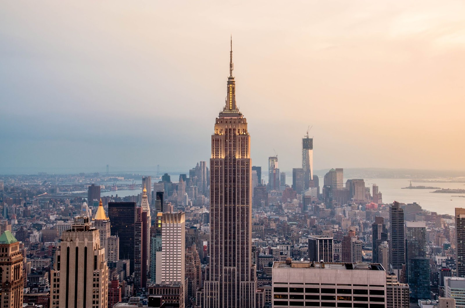
Homepage
- App Header Logo reflects company or property logo
- Logo is transparent
- Logo is overlaid across the sky or an area that makes it visible
- Cover image is high quality with no pixelation
- No App Header Logo in Property Settings
- Property logos were re-sized and placed strategically
Amenities
Always use a high-quality image and a description for all amenities. Try to avoid repeating photos. Make it a goal to have an even number of amenities.
Property Contacts
Call & Email options should be combined on one tile where applicable. Always use a high-quality image for each tile.
Discover Links
- At least 8 discover links.
- High-quality photos for each Discover Link.
- Try to avoid images containing logos or excessive text.
- Discover Link Categories can be used to group together related resources.
 Check out this article on image sizing!